Last week, I showed you how to do a basic drop shadow effect using the free graphic design software, GIMP. This week, I'm going to build on that same tutorial and show how to add some color and interest to the text using the gradient tool.
1. Finish the first tutorial before moving on to this one. Here's what you should have to start:
2. In the toolbox, right click the "Text" layer and select "Alpha to Selection." Then create a new transparent layer through Layer: New Layer. Name it "Gradient." Since we're working on this new layer, we can experiment without affecting the original text beneath. And because we've created a selection in the shape of our words, the gradient will only fill that shape.
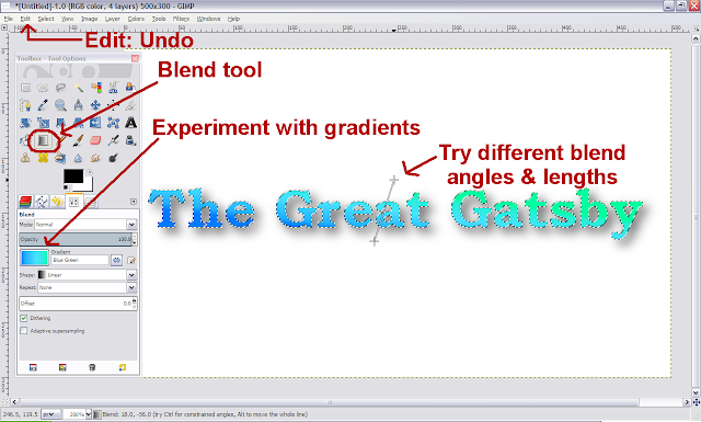
3. Select the "Blend" tool in the toolbox (the gray square next to the paint bucket). By default, the tool is set on FG to BG (foreground color to background color) and a linear gradient. Where it says "Gradient," click the sample picture to the left. A pop up will give you all kinds of preset color gradient options. Experiment with that. To fill your text, hold down your left mouse button and draw a line over the selection. Click "Edit: Undo" and try different effects. Notice that the effect is a little different, depending on where you draw the line and how long it is:
4. You can also blend using two colors of your own choosing. Go back and click on the setting that says "FG to BG (RGB)." Now, go up to the foreground and background colors (black & white are the default: it's the little overlapping squares with an arced arrow next to them). Click on the foreground color. In the pop-up, you can experiment to find a color you like or type in a specific color hex code where it says, "HTML notation." (For reference, the black code is 000000 and the white code is FFFFFF). I used 00c000 (a light-medium green). Click "Ok" and do the same for the background color. I went with a darker green (007b00). Using two shades of the same color adds a little variety / depth to the text without being too distracting or making the text hard to read.
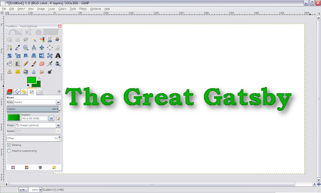
5. Now, in the Blend toolbox, change "Linear" to "Shaped (spherical)." Draw your line over the text and you should end up with a rounded-looking green text effect, like this:
6. Keep experimenting until you get familiar with all the options. Click "Edit: Undo" and try different color combinations, shapes and angles.
7. Finally, to repeat from the first tutorial: save your file to GIMP (.xcf). That keeps all the layers separate so you can keep working on your image. Or, you can merge all your layers down into one (Layer: Merge Down) and export to the format you need.
Another tip:
-If you want to keep a slight black border around your text, before you make the gradient, click Select: Shrink and shrink your selection by a small amount so that some black from the "Text" layer shows through. Then do the gradient. In this example, I only shrank by one pixel and got a black border:
If your image/text are bigger, you'll likely need to shrink the selection more.
That's how to make basic text gradients in GIMP!
I'm not sure what I'll teach next week. Stop by to find out.
-MK
on Zazzle
on Kindle


No comments:
Post a Comment
Thanks for contacting MK Hess Creative.